· 5 min read
Steps to Increasing Your Mobile Game’s Organic Installs: Key Lessons From Social Quantum
Mary Kulikova
Head of Content at AppFollow
Editor’s Note: This post was originally published by our good friends at AppFollow. You can read their version here.
Social Quantum is a video game company whose #1 game, Megapolis, was first launched back in 2011. And as most of you will know, their game, Megapolis, is a long-standing city builder that has become one of the top worldwide mobile games over the years.
Pretty much from day 1, Social Quantum worked primarily with paid traffic. And for those long-standing developers reading this, back then this was more than enough to attract gamers. But as the app stores were growing, it became obvious that using only paid acquisition was not enough anymore. For Social Quantum, this meant looking for new and more creative ways to get more gamers.
In this post, Social Quantum and AppFollow have teamed up to share key techniques into how developers can increase their organic installs (and what they did to improve Social Quantum’s by up to 110%), as told by Mary Kulikova at AppFollow.
What were the key issues?
Setting up an ASO strategy can be tricky. Specifically, because you can’t be sure which assets or keywords will work, and the results may not be obvious while you’re experimenting. In the case of Megapolis, we tried several strategies before finding the right asset that led to a nearly instant boost of installs.
Here are the main steps we followed:
Preparations
Every app has some basic ASO on their app store page, even if they don’t focus on App Store Optimization. At the very least you have an app title, icon, some descriptions, and screenshots. In the app store, the game page is the face of a product, and a good-looking page attracts far more users. What is even more important is the way the game looks from the search page.
So the first thing every developer should do to get more users is to renew a game page according to the latest trends of the mobile games market. Which tends to be a burning problem when it comes to old-school games.
Step I: Icon and keywords
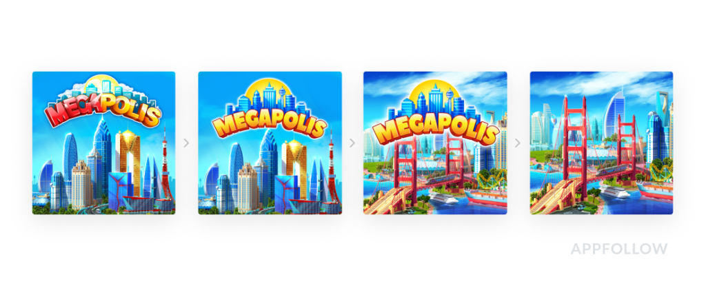
Megapolis started its return to glory by conducting several tests on the icon. The biggest problem here being that the old icon looked far too archaic for new players.

After several tests, we were able to find the highest performing icon, which surprisingly is the 4th one in this graphic.
Additionally, the ASO managers used the AppFollow Keyword Research Tool to find essential keywords for the title, subtitle, and game description. It was the first time we worked with keywords deliberately, and it absolutely paid off.
Among game developers there is the opinion that you must not include keywords in the app title — your brand name should work for you instead. But rules are arguably made to be broken, and so we decided to bend this rule and actually added keywords in the app title. We found the best fit for their category and used keywords like “city building” in Megapolis’ app title.
After that, we updated the subtitle and description (on Google Play) and filled in the keyword field in the App Store.
Results
Shortly after launch, the number of keywords in the top 10 doubled in Google Play and increased threefold in App Store. Adding new localized keywords in every localization had also improved the game’s organic visibility.
Still, that wasn’t enough for the Apple App Store. So the experiment continued.
Step II: App preview video
As Social Quantum already had app preview videos before, this was the perfect place to start with the next set of experimentations.
This is the preview video used back in 2017:
Using this video, we made a deep analysis of this video, as well as our competitors’ videos, and found out that it had become completely outdated. According to the market trends, we needed a more dynamic video with more diversifiable content and shorter CTA captions.
So alongside our product team, we chose the main mechanics we wanted to show. We ended up removing the personas we used in the old video to make users focus on the game features. The video has become more dynamic and the call-to-actions are shorter and clearer.
This is the final version of the preview video:
Due to Megapolis’ game age, we made a pre/post test for the video. This approach doesn’t require extra test tools, we just measured conversion rates and the number of installs before and after this change. The most important thing is to make sure you only change one asset in the update (you want to be comparing apples to apples, after all). We knew that this kind of risk could cost us, but we still decided that it is worth trying.
The results
The update with the new App Store preview went live on the 11th of December. Despite being released for English locations only, we saw the first splash in installs the day after. And despite this being the perfect excuse to get the champs out, we knew that the results could be partially affected by a seasonal install spike.
If you’ve enjoyed this post, make sure to learn more about AppFollow here. Equally, there’s a ton more resources out there that you can dig your teeth into, some of which are: